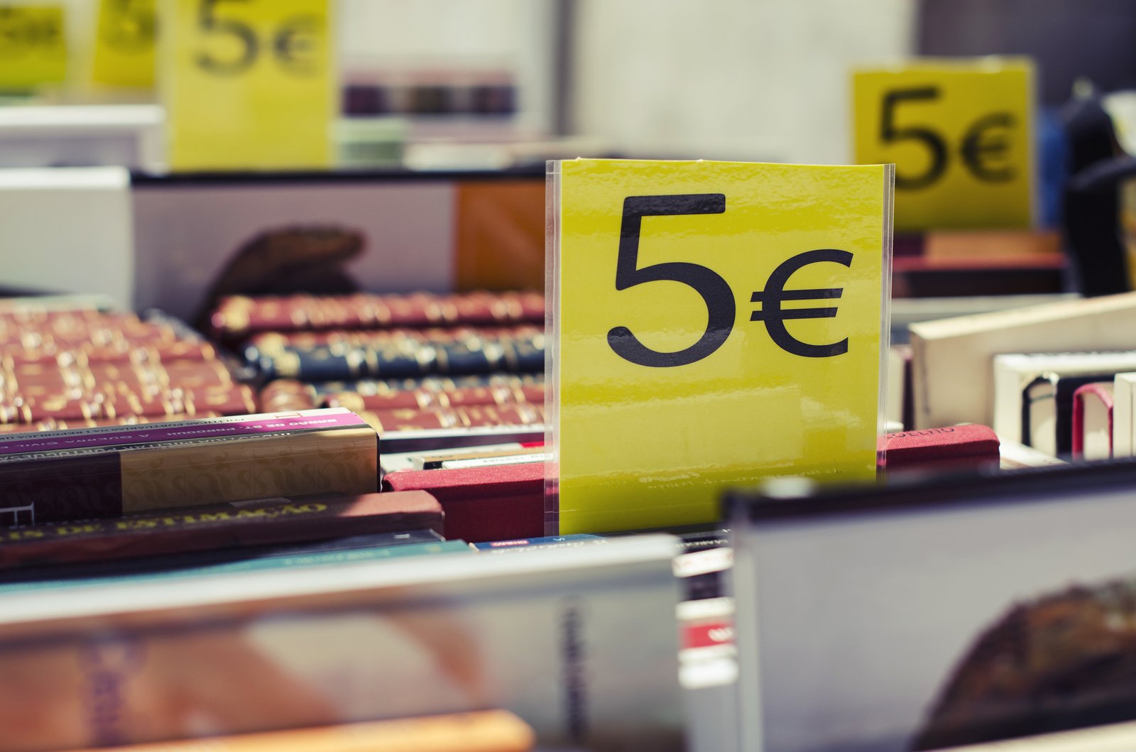
Psychological pricing means showing a price so that it feels lower or higher than its number, as with €29.99 instead of €30. The research behind it covers much more than the 9 ending.
Lists of “techniques to display your prices better” are everywhere. They quote brands, percentages and experiments, and seldom the source. A lever backed by a solid study can be tested with confidence. An anecdote repeated from blog to blog calls for caution.
I took the most quoted techniques and traced them back to the original work. Some hold up well. Others rest on a single restaurant, twenty participants or a story with no source.
The price is read from left to right
Manoj Thomas and Vicki Morwitz describe the left-digit effect in a 2005 paper in the Journal of Consumer Research, built on five experiments. A price of €2.99 looks lower than €3.00 because the brain encodes the first digit first. The authors specify the condition: the effect appears when the left digit changes between the two prices, which does not happen between €2.79 and €2.80. For a catalogue, prices ending in 9 serve to cross a ten or a hundred.
Example: the brain files earphones at €99.99 under “€90” and those at €100 under “€100”. Between €41.99 and €42.00, the left digit stays 4 and the effect disappears.
An announced price changes what people feel
A research team (Plassmann, O’Doherty, Shiv and Rangel, PNAS, 2008) had 20 participants taste wines in an MRI scanner, each presented at a different price. There were three wines in all: the same wine appeared at $5 and then at $45, another at $90 and then at $10. The higher the announced price, the more pleasant participants said the taste was, and the more a region of the cortex linked to pleasure lit up.
Two limits are worth keeping in mind. Participants did not pay for the wine, and a control tasting eight weeks later, without prices, no longer showed a difference. This study shows that a low price can pull perceived quality down.
Example: a $5 wine announced at $45 received better pleasure ratings than the same wine announced at $5. For a service offer, a package at €490 cut to €290 can read as a lighter version. Before lowering a price, check what the cut says about quality.
The currency symbol weighs on spending
Sybil Yang, Sheryl Kimes and Mauro Sessarego (Cornell, International Journal of Hospitality Management, 2009) handed out three menus to 201 diners at a restaurant: prices with the dollar sign, prices without the sign, prices written out in words. Without the sign, average spending was $5.55 higher, about 8%. Between the sign and the words, there was no difference.
The sample comes from a single venue, run by a hospitality school. Before removing a symbol on a product page or a quote, check the price display obligations. A more discreet version of the symbol, in a reduced size, deserves a test.
Example: on a menu, “20” instead of “€20”. On a website, the same principle gives a symbol smaller than the amount, for instance “20” in large type and “€” in a reduced size.
Splitting the price into small amounts
John Gourville published “Pennies-a-Day” in the Journal of Consumer Research in 1998. The same cost seems more acceptable as small recurring amounts (a few cents a day) than as a lump sum. His explanation: splitting makes people compare the price with small everyday expenses, while the lump sum makes them compare it with large ones.
Later work by the same author, published in Marketing Letters, reports that the effect reverses for high amounts. For a software subscription at €39 a month, the “per day” framing makes sense. For a contract worth tens of thousands of euros, testing comes before the decision.
Example: a subscription at €39 a month can also be written “€1.30 a day”. A yearly price of €360 can be written “less than one euro a day”. The total paid is identical, and the comparison is made with a small everyday expense.
Decoy and anchoring: two well-studied effects
The decoy. In Dan Ariely’s experiment, reported in Predictably Irrational (2008), 100 MIT students chose between three The Economist subscriptions: web only at $59, print only at $125, print and web at $125. 84% took the combined offer, 16% the web-only one, none the print-only one. Without the print-only option, 68% chose web only. An option nobody picks can steer the choice between the other two.
Anchoring. Amos Tversky and Daniel Kahneman (Science, 1974) spun a rigged wheel in front of participants, then asked them for the share of African countries in the United Nations. When the wheel stopped on 10, the median estimate sat around 25%. On 65, it rose to around 45%. A number unrelated to the question moved the answer. For a commercial proposal, look at which figure the reader sees first.
Example: a pricing page with three plans. Essential at €29 a month (1 user), Advanced at €79 (5 users), Complete at €79 (5 users and dedicated support). Few customers take Advanced, and Complete becomes the obvious choice. On a quote, placing the €18,000 premium package before the recommended €9,800 plan applies anchoring.
Discounts: percentage or euros
The rule of thumb, popularised by Jonah Berger in Contagious, is to show a discount as a percentage under €100, and in euros above: the larger number hits harder. It rests on research from the 1990s (Chen, Monroe and Lou, 1998, according to the syntheses I consulted). I have not re-read the original paper, and the €100 threshold remains an approximation. An A/B test on both formats gives a more reliable answer than the rule.
Example: on a €40 item, “-20%” hits harder than “-€8”. On a €800 item, “-€120” hits harder than “-15%”.
A red price: a real but narrow effect
Puccinelli, Chandrashekaran, Grewal and Suri (Journal of Retailing, 2013) ran three experiments with about 400 participants. Men judged savings to be larger on a red price than on a black one. Women reacted less and remembered the original price better. The effect disappeared once participants examined the offer with more scepticism. A red price may change nothing on a considered purchase.
Example: during sales, the new price in red and the old one struck through in grey on a consumer product page. On the pricing page of a B2B contract, where the buyer compares and checks, red adds nothing.
Urgency, scarcity, struck-through price: a framework to respect
Messages such as “Only one room left” play on loss aversion, described by Kahneman and Tversky. They also attract the attention of regulators. In February 2019, the UK Competition and Markets Authority (CMA) obtained commitments from several booking platforms, including Booking.com, against pressure selling messages. In September 2019, the consumer association Which? found that five of ten “only one room left” messages on Booking.com did not reflect real availability. Booking.com pointed out that the CMA had closed its investigation without finding an infringement.
For struck-through prices, European Directive 2019/2161 requires showing the lowest prior price of the last thirty days. Check the national transposition rules with legal counsel before any campaign.
Example: “Only 3 left in stock” is displayed if actual stock is 3. A struck-through price of €120 is justified if €120 is the lowest prior price of the last thirty days.
Where to start
Three steps are enough:
- Choose one page: a product page or a pricing page with high traffic.
- Apply one lever at a time (for instance, showing the instalment amount or reducing the symbol size).
- Measure conversion before moving to the next one.
On acceptable prices, customer surveys are worth as much as cognitive effects. The Van Westendorp method asks four questions: at what price does the product seem a bargain, too cheap to be good quality, expensive, too expensive to consider. The answers draw an acceptable price range before any test.
At Digital Pulsing, we support companies that are reviewing their online store or their B2B offer. Our free diagnostic gives a first benchmark of digital maturity, before choosing the projects that matter.